Case Study 01 · Dooly
Early User Experience
Redefining Dooly’s core value, and fixing the 10 seconds that were costing us new users.
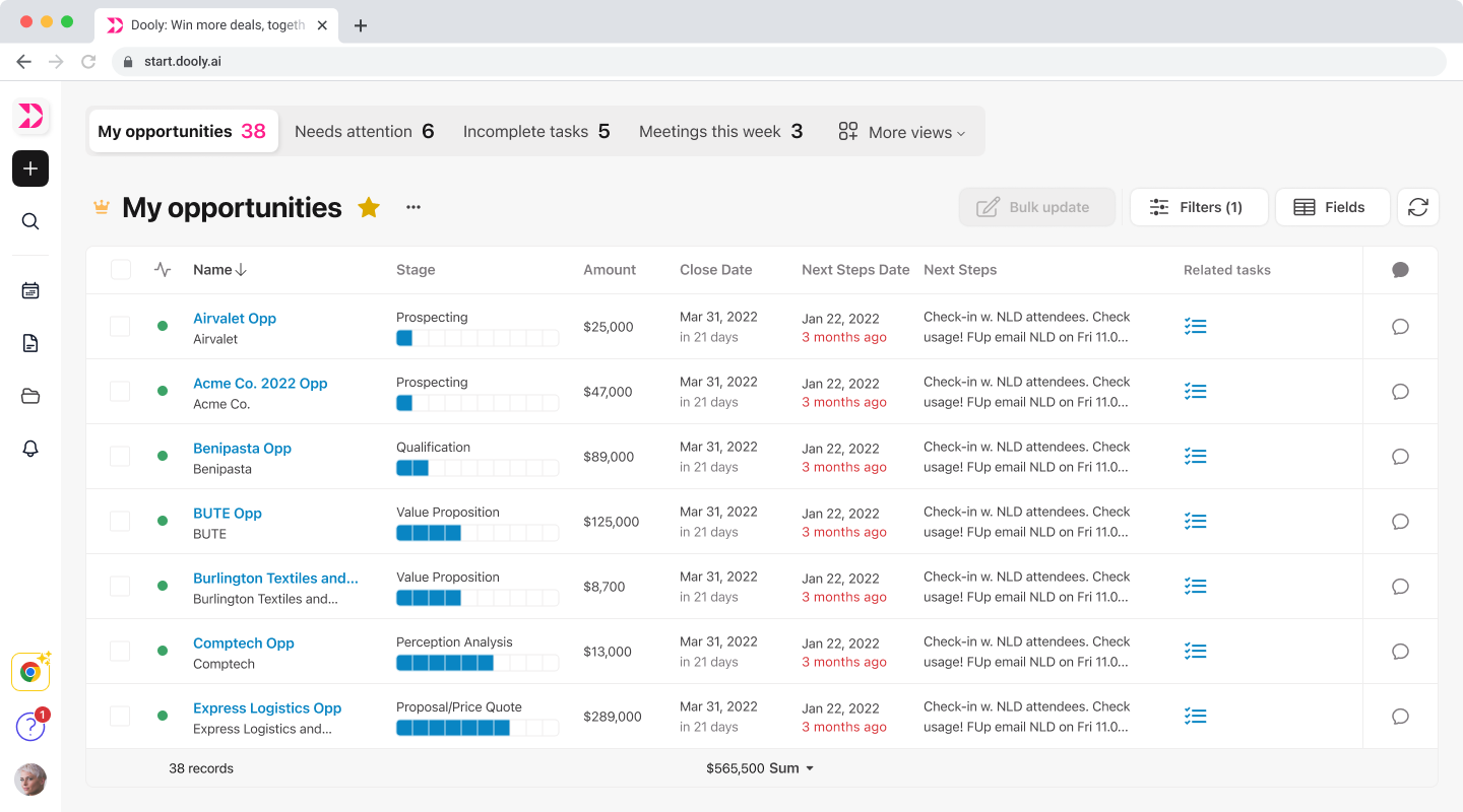
At a glance
The product
Dooly is a workspace for B2B sales reps. I reworked its early experience, the first 180 seconds after signup, plus the navigation around it.
The problem
New users signed up and left within 10 seconds. Two onboarding redesigns hadn't moved activation and no one could say why.
What I did
Reframed activation from a value problem to an orientation problem, figured out the product's core value, and rebuilt the first run and navigation around one early win.
The impact
About a 40% lift in completion in early data, plus a clear product direction that shaped a year of roadmap.
The mystery
New users signed up for Dooly and left within the first 10 seconds.
Two onboarding redesigns and a handful of value prop experiments had already come and gone without moving anything. So the real question was never “how do we improve onboarding.” It was “why does nothing we try work?”
Economic downturn
61%
of sales pros say selling is harder than it was five years ago
Fragmented workflow
5+ hrs
lost every week just reporting updates across disconnected tools
Low activation
10 sec
before new users dropped off after entering the product
All of that was real, but none of it explained the 10 second drop off. That’s what I set out to figure out.
Who I designed for
The primary user was the account executive, not the sales manager or leadership. Managers and leadership were the buyers, but the AE was the person in the product every day, and the one we needed to activate. If I’d designed for the buyer, I would have pulled the first run away from the person who actually had to get value from it.
Primary user
Account executives, not the sales managers or leadership. They were the buyers, but AEs were the ones in the product every day.
Segment
Mid-size to enterprise B2B SaaS AEs with longer, more complex deal cycles, where the product had the most pull.
Their pressure
Hitting the same quotas with smaller teams and less support, while losing hours to CRM busywork.
My role
Design lead on a team of eight, working with product and engineering.
I drove the product vision and owned the strategy for this work, led the user research, and redesigned the early experience and navigation. I’d been on the team longer than any other designer, so I held a lot of the user context and spent real time getting engineers and newer designers up to speed on who we were building for.
Constraints
- A company proud of what it had built, which made changing our product identity hard.
- Caution from the board, since changing direction felt risky.
- Fast growth. The team had roughly doubled, and our product and design processes were still catching up.
- Engineers had almost no face time with users, so part of my job was closing that gap.
What was actually at stake
Dooly’s three-year vision was a connected workspace that makes it effortless for revenue teams to share insight with the people and systems that need to know. This project was an early step toward that. If new users couldn’t even get their footing, none of the bigger vision mattered yet.
User problem
AEs needed to win back selling hours by cutting the “busywork,” so they could focus on what actually closes deals.
Business problem
New users had to feel real value in the first 180 seconds, to earn the chance to show them more over time.
We landed on 180 seconds because that’s roughly how long a new user gives you. People decide pretty quickly whether a product is worth their time, usually within a couple of minutes, so that became our benchmark for showing value.
The goal wasn’t arbitrary either. It tied straight back to the business goal of driving user growth, which came down to one simple measure: did new users reach value within 180 seconds?
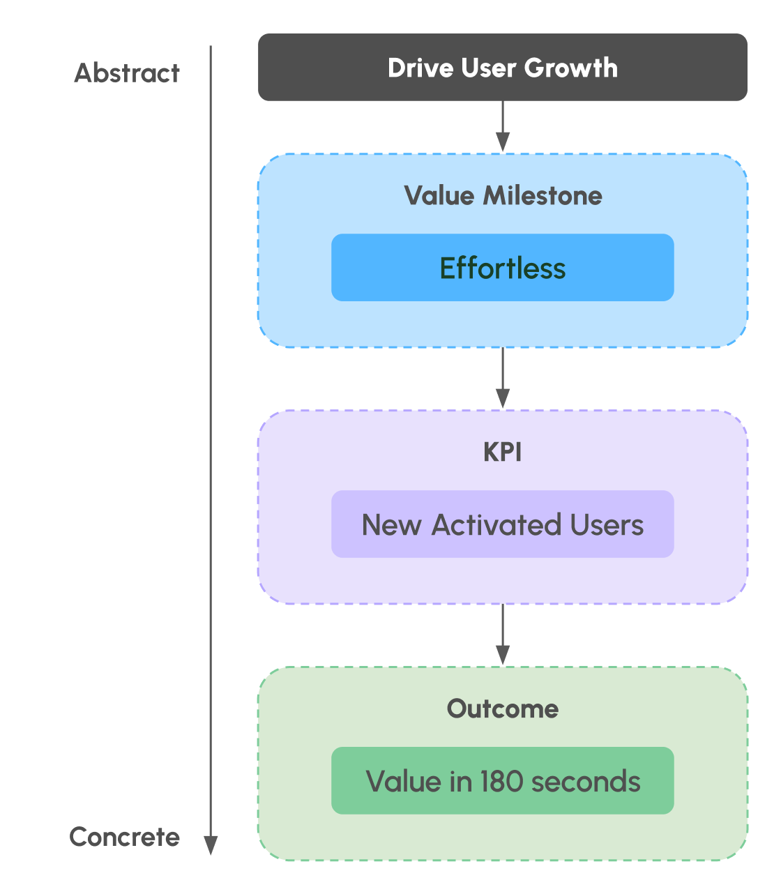
Under all of that was one question the team couldn’t agree on: was this a product market fit problem, or a UX problem? We’d tried different value props and activation hadn’t moved, so no one could say whether we weren’t offering enough value, were too hard to adopt, or were going after the wrong users.
Understanding the problem
Before I proposed any changes, I wanted to understand why activation kept resisting every fix. I looked at it from a few angles, and everything below comes out of what I found.
I also brought the team along as I went, engineers especially, since they rarely got face time with users. Rather than hand down conclusions, I invited them into the exploration and shared what I was learning, so we built a common understanding of the problem together.
The root of the busywork
I used IDEO’s Problem Mapping to break “busywork” into layers: the behaviours on the surface, the structures underneath them, and the mindsets under that. It showed how deeply the busywork was baked into the way sales teams are run and measured.
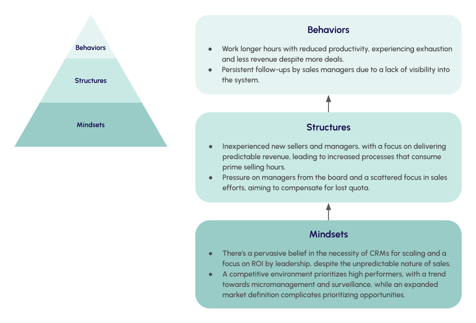
Key takeaways
- BehaviourAEs work longer hours doing busywork but get less selling done.
- StructureManagement is incentivized to optimize for predictable revenue.
- MindsetYou can’t scale predictable revenue without CRMs.
Organizing the pain around the strategy
Focus and speed were the two strategic themes leadership had set. Meanwhile, AEs just kept saying “Salesforce sucks,” which you can’t really design against. I took their specific complaints and organized them under those two themes, which turned a vague gripe into something the team could actually understand and work on.
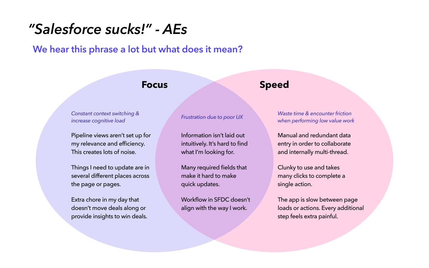
Where to intervene first
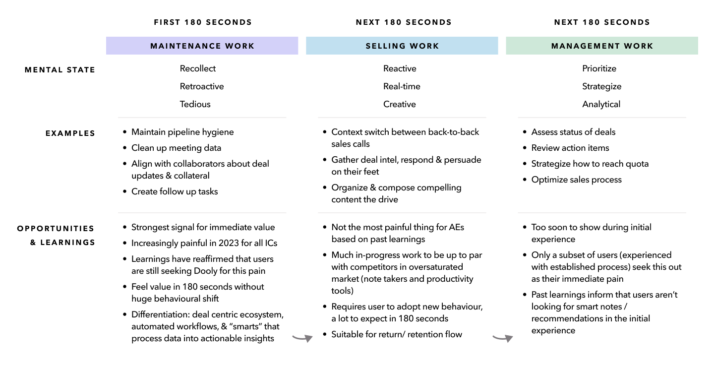
Not all of an AE’s work is the same. I split their day into maintenance, selling, and management work, and made the case that the fastest way to a first win was the maintenance work, the part we could actually own and deliver inside the first 180 seconds.
The decisions
Two calls shaped the redesign before any screens: what the real problem was, and what to lead with.
It was a UX problem, not a value problem
Half the team thought activation was a value problem, that we needed a clearer job-to-be-done. The other half thought it was UX.
I didn’t buy the value theory, mostly because we’d already tested it. Two onboarding redesigns and a handful of value prop experiments had come and gone without moving anything. When the obvious fix fails twice, it usually means you’re asking the wrong question.
I ran a UX audit, splitting the journey into phases to find where people were dropping, went back through the feedback we already had, and ran a heuristic evaluation with the team. What I found was simpler than the value debate: people were leaving in the first 10 seconds because they couldn’t get oriented. There were no page headings to anchor to and no obvious way to move between pages, so they never got far enough to judge whether the product was any good.
My read was that it was both, but the UX layer was the thing blocking everything else. You can’t tell whether your value lands if people can’t find their footing in the first 10 seconds. I made the case for fixing the experience first, instead of reaching for another value fix.
The data backed up where to aim. New users were 59% more likely to come back if they interacted with a record on their first visit. Rather than teach the whole product, we focused the first session on getting them to one useful action, like updating a deal or cleaning up a note.

Painkiller before vitamin
The long-term goal was the “vitamin,” helping AEs actually become better sellers with the right information and support to move deals forward.
I decided to lead with the “painkiller” instead: cut the busywork clogging their process and their tools so they could get back to selling. It was about order, not ambition. The immediate pain is what earns a quick “aha.” The coaching value is real, but it’s slow to prove and was never going to drive activation on its own. Land the painkiller first, get into their daily workflow, and we’d earn the room to add the vitamin later.
What I made, and the thinking behind it
The changes followed the two decisions: first, fixing the usability problems the audit surfaced, then leading with the painkiller through a faster first run.
Hick’s Law · Anchoring
The pipeline as the front door
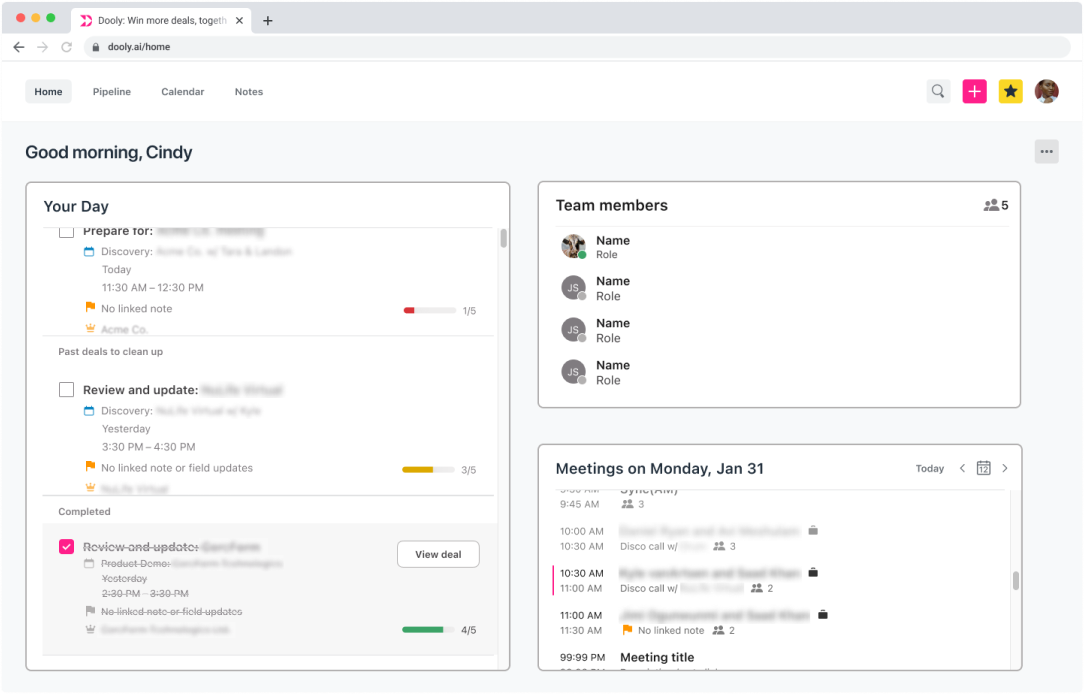
Instead of dropping people onto a dashboard of widgets, I made the pipeline the landing page. Removing the dashboard cut the many ways to wander around the product (Hick’s Law), and the pipeline gave people a strong anchor for the core flows, matching how they already think about their deals (Anchoring).
Cutting something the company was attached to was the harder call, but the dashboard was built for returning power users right when we needed to help a confused new one.
Before
After
Recognition rather than recall
Easier switching between views
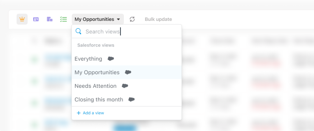
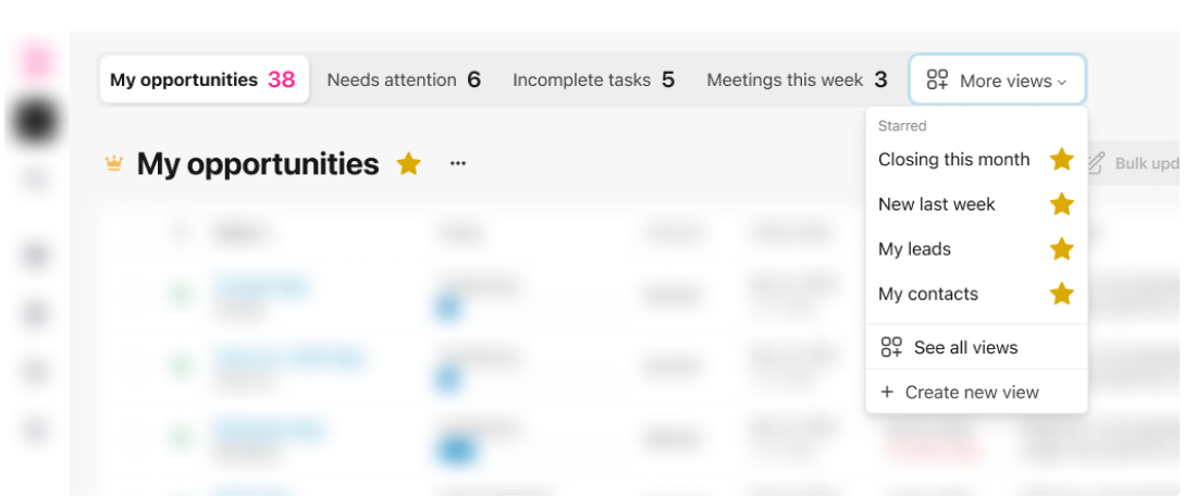
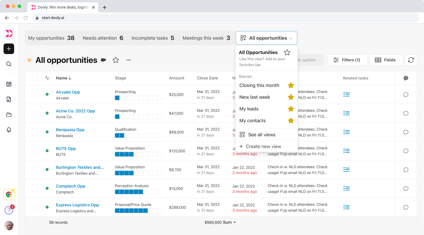
Power users can build up a lot of pipeline views, often 20 to 50 of them, and the old dropdown buried the ones they used every day, so they had to remember where things were. I moved view switching into a bar of starred views you can favourite (recognition rather than recall), with defaults based on the role someone picked at signup. Their most used views are visible and one click away, and new users can spot the use cases that fit them right from the start.
Before
After
Painkiller before vitamin
A short, tailored setup instead of a tutorial
This is where the painkiller showed up. Past onboarding leaned on long tutorials people skipped, so instead of front-loading everything, I cut the setup to what mattered: new users pick their role so the workspace matches how they work, connect their calendar so the pipeline fills with real meetings and deals, and tooltips explain the value as it comes up. They reach a populated, relevant pipeline in their first session instead of sitting through a walkthrough.

Across every surface
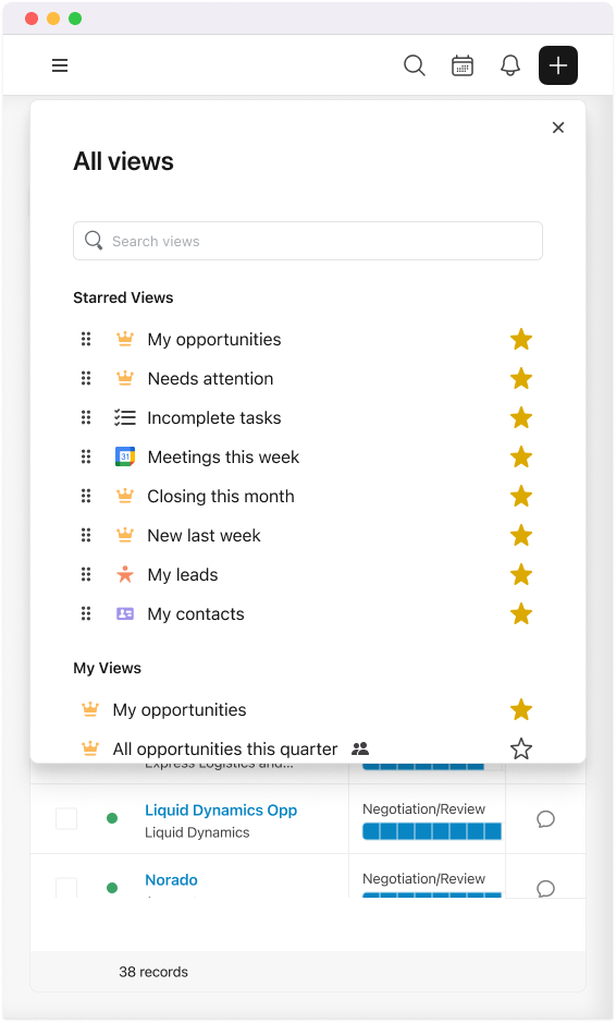
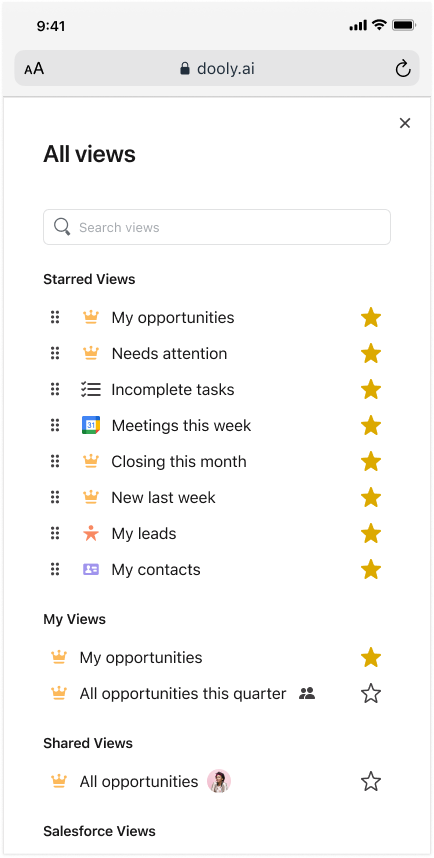
AEs don’t only work in the browser. The pipeline and its views had to hold up in the Chrome extension and on mobile too, so the same starred views stay usable even on a narrow screen.
Web app
Extension
Mobile
Testing and shipping
I tested a high fidelity Figma prototype with real AEs across nine remote, moderated sessions, internal and external reps, and used their feedback to refine the flow before anything got built.
To ship it, I worked closely with engineering to untangle the dependencies the changes created, mostly around the new navigation and removing the dashboard, which meant relocating that widget functionality elsewhere in the product. Engineering was involved throughout, so the handoff was a collaboration, not a toss over the wall.
Here’s the prototype itself. Click through it to get a feel for the new flow.
Outcomes
Early FullStory session previews showed about a 40% lift in completion in the new user experience. This was an early read, not a final number.
In interviews, users got the value right away and said how much easier it felt, which was exactly what used to break in the first 10 seconds.
The flow finally matched how users pictured a "deal workspace," which moved us toward the longer-term vision.
The direction it set carried into later phases of the product, like the advanced pipeline and the Deal Overview redesign.
What I’d do differently
The scope was bigger than my authority could resolve in the time we had. Shifting the product’s identity inside a company proud of what it had built, and cautious about big swings, took more buy-in than any one role holds. I drove the vision and owned the strategy, and worked closely with a lot of people across the org to push it forward, but a change this size needed more decision making power than my role carried, and more time than we had, to fully land.
I collaborated a lot on this and pushed it a long way, but if I did it again, I’d raise the flag sooner. With the pressure to keep showing progress, I kept driving the work forward before I recognized that part of the problem needed a call from a higher level before I could take it further. I took that to my manager later than I should have, and catching that kind of blocker earlier is what I’d change.