Case Study 02 · Dooly
Deal Highlights
Capturing the deal context Salesforce couldn’t hold, and negotiating the room to put it somewhere.
At a glance
The product
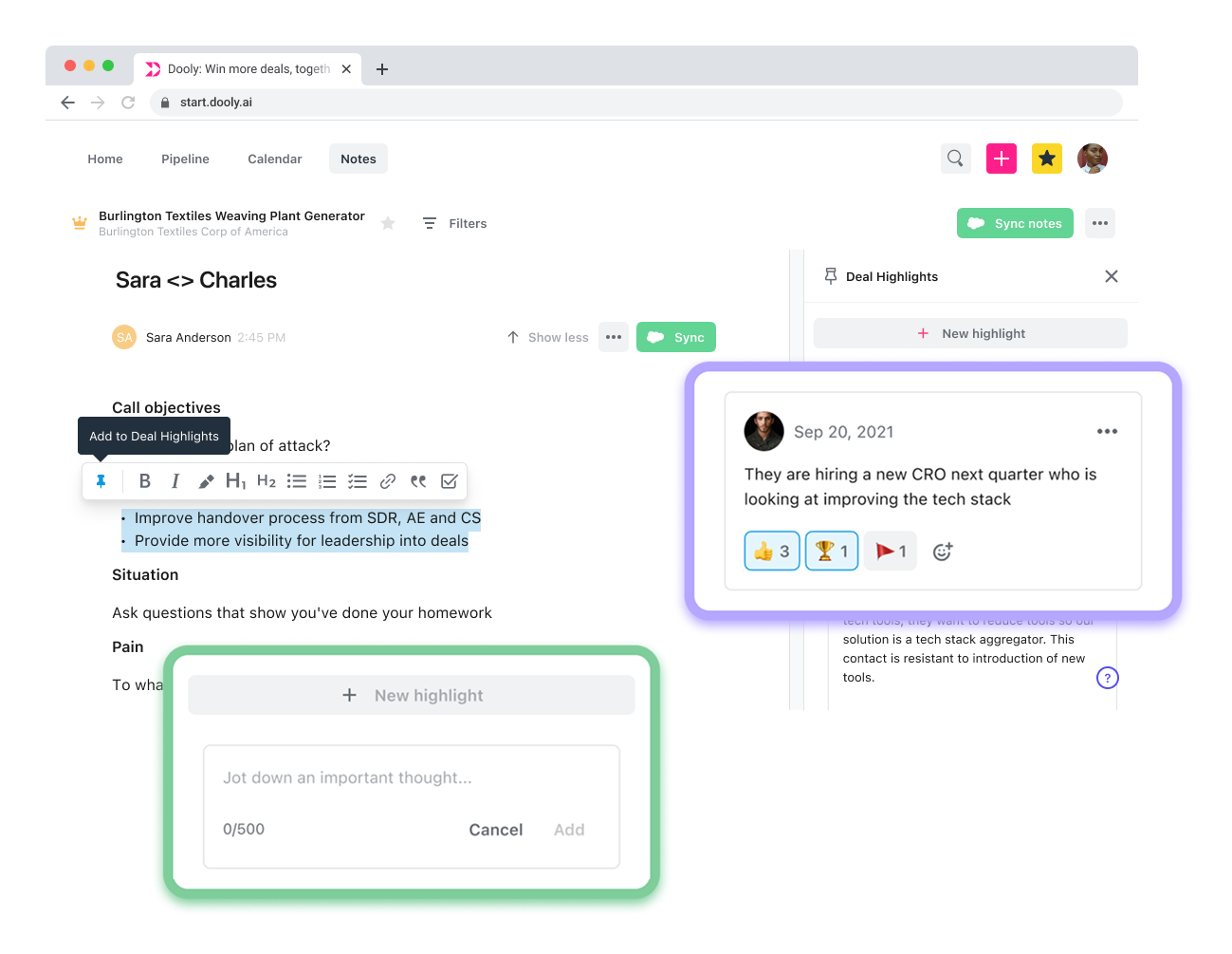
Dooly is a workspace for B2B sales reps. Deal Highlights is a running list of deal facts, pulled from sales notes or written directly, that sits beside the note editor and on the record.
The problem
I was asked to drive virality through invite and sharing mechanics. That was slow going, because account executives compete with each other and had no reason to invite peers into their tool.
What I did
Reframed virality as team selling, designed a place for the qualitative deal context that Salesforce loses, and negotiated a competing feature out of the space I needed without killing it.
The impact
Roughly 60% positive sentiment in customer success surveys and strong testimonials, alongside low adoption on the first release.
Where it led
Along with the About This Deal card I designed next (18% lift in field updates), it showed where manual capture runs out and became my case for AI generated suggestions.
The growth problem
We were struggling to grow our user base, and I was asked to focus on virality. In practice that meant invite mechanics: get reps to invite teammates, share notes, share pipeline views, share documents.
It was slow going, for a structural reason. Account executives compete with each other for quota. Asking one of them to invite another into the tool they run their deals out of is asking them to hand over an edge, and nothing about the way they’re measured makes that worth doing.
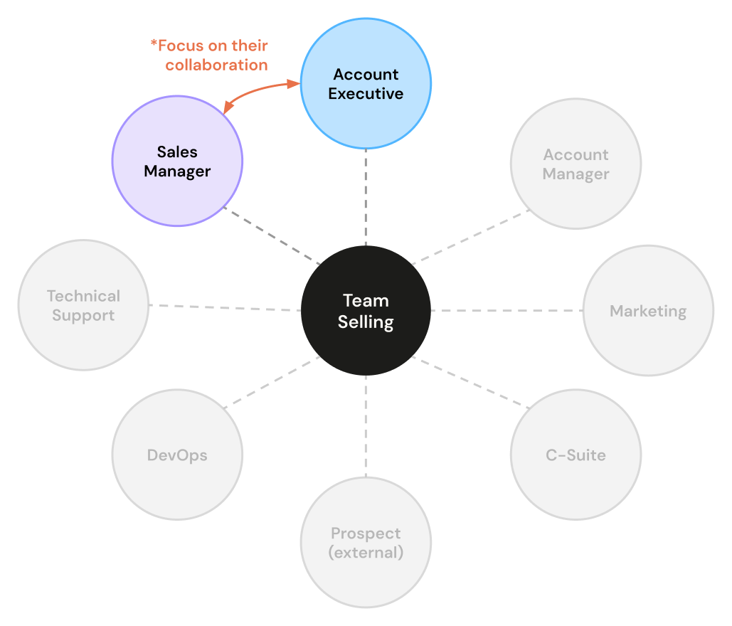
Closing a deal isn’t a solo job though, since legal, finance, product, customer success and the rep’s manager all touch it at some point. The collaboration that was already happening every week was between an account executive and their sales manager, and we had nothing in the product supporting it.
Who I designed for
I scoped to the account executive and the sales manager, which happened to pair our user persona with our buyer persona, and their problems turned out to be opposite sides of the same gap in the product.
- Account executives forget key details on deals that run six to twelve months, and want to walk into a call prepared enough to build rapport and handle objections.
- Sales managers can’t see the deal facts they’d need to judge whether a deal is really viable, or to spot the moment where a rep needs coaching.
Primary user
Account executives, who live in the notes every day and carry deals that run six to twelve months.
Second user
Sales managers, who were also our buyer persona. They needed enough deal context to judge viability and to know when to step in and coach.
Why both
The whole idea rested on the two of them working off the same context, so designing for only one of them would have collapsed the point.
My role
Product design lead on a team of six, working with a product manager, an engineering manager and engineers.
I drove the project from discovery through launch. I led the user research with my PM, facilitated the design workshops, defined the collaboration and interaction model, and worked the feature through the stakeholder and engineering negotiations it needed to actually ship.
Constraints
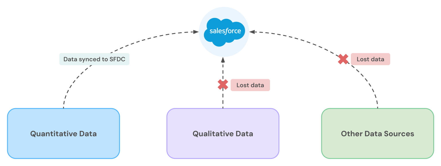
- Salesforce is built to capture quantitative deal data, so anything qualitative had nowhere structured to live.
- The note editor was already a three column layout, so adding anything meant taking space from something else.
- Playbooks, the feature holding that space, was a key selling point for our buyers even though users barely touched it.
- We had no in-app pattern for feature discovery, and squad priorities were pulling against building one.
Understanding the problem
I led discovery with my PM, interviewing account executives and sales managers both inside and outside the company, because I wanted the nuance underneath the requests we were getting rather than the requests themselves. What I was trying to get at was which pieces of information they actually cared about, why those ones, and what job the information was doing for them once they had it.
The art and the science
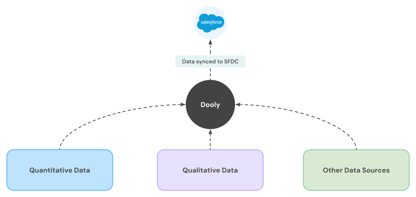
Reps capture deal context by updating Salesforce fields like next steps, number of seats and amount, which is the science of the deal and the thing Salesforce is genuinely good at holding. The art is the rep’s own read on how it’s going, which sounds more like “they’re hiring a new CRO next quarter who wants to clean up the tech stack.”
Those two often tell you different things about the same deal. The fields can read as healthy while the qualitative context explains why it’s about to stall. Salesforce has no structure for the second kind of information, which meant it either sat in a note nobody went back to or stayed in the rep’s head.
Where the context leaked
Talking to reps, the losses fell into three shapes, and none of them had anywhere to go.
- Prospect notesPersonal details a rep uses to connect on a call, like where someone's daughter is going to school. Useful, and not something you'd put in a shared CRM field.
- Passed along factsA Slack message from another department saying the account just raised a Series B. It never came out of a meeting, so it never became a note, so it never reached Salesforce.
- Micro changesReps chase prospects across whatever channel gets a reply. Those small updates rarely made it back into the deal record, and deals went stale on paper while they were moving in reality.
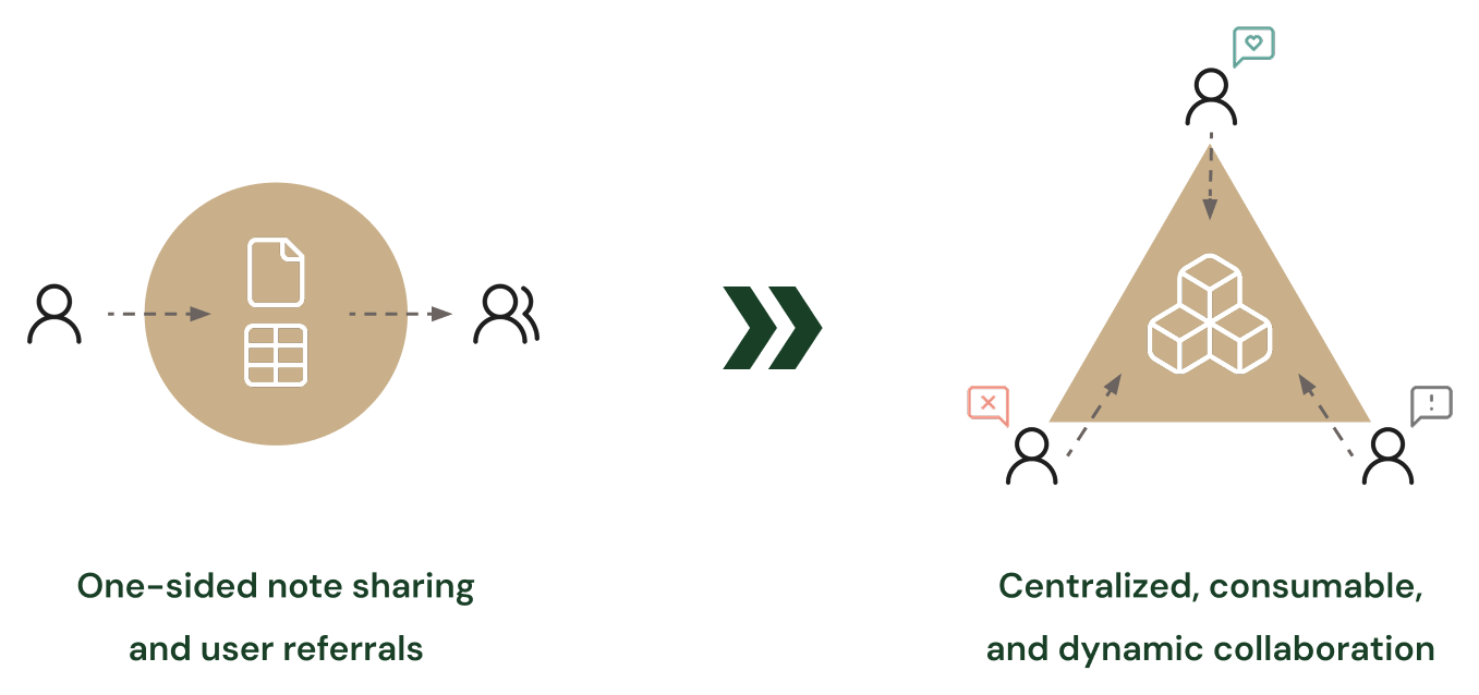
Sharing any of it cost something too. A manager who wanted the picture either got a summary the rep had written by hand after going back through their notes, or skipped the notes and asked the rep directly. The context was never in a shape anyone could just read.
The decisions
Three decisions shaped this project, and they happened in sequence. The first changed what we were building in the first place. The second and third belong together, since choosing where to put the feature is what led into the hardest conversation of the project.
Build virality through team selling, not through invites
I took the growth problem back to the team with a different question: what if we build virality by enabling team selling instead of by asking reps to invite each other?
Team selling is two or more people working a deal together, across the sales team or across departments. It was already happening at every company we sold to, and none of it was running through our product. If we made Dooly the place where a rep and their manager built a shared picture of a deal, the sharing would come out of the work itself instead of out of a prompt asking people to share.
That reframe changes who you have to persuade, because invite mechanics need a rep to act against their own incentive, whereas team selling gives them a reason that already exists in their week and lets the growth follow from it.
The drawer, over three other places it could have gone
Before choosing a layout I mapped the note editor page by priority, marking every component as primary, secondary or tertiary. I wanted the placement argument grounded in what the page was actually for rather than in whose feature it was.
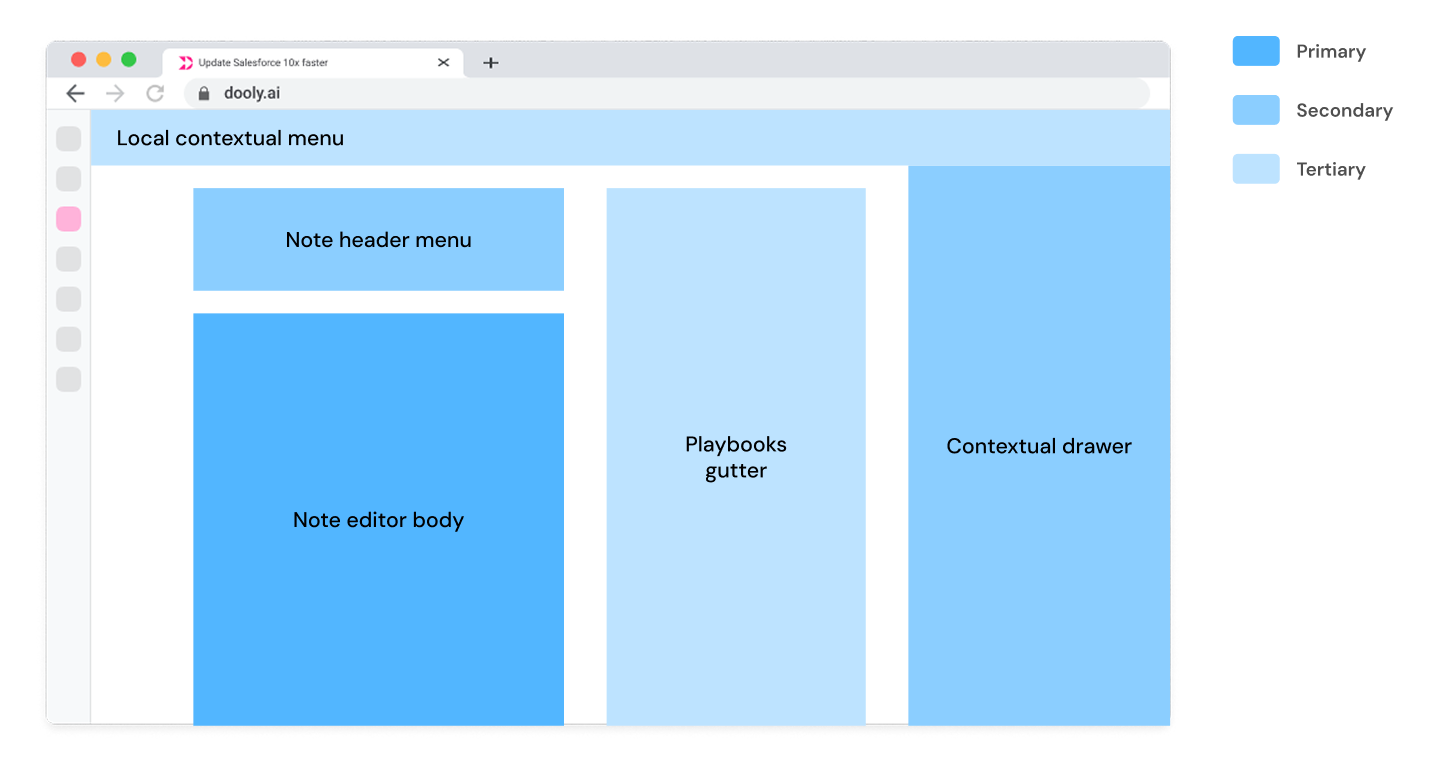
Then I explored four placements:
- Above the thread of sales notes, opening in an accordion.
- Inline in the note itself, sitting above the editor component.
- In the right gutter, alongside the existing Playbooks feature.
- In a drawer next to the note editor.
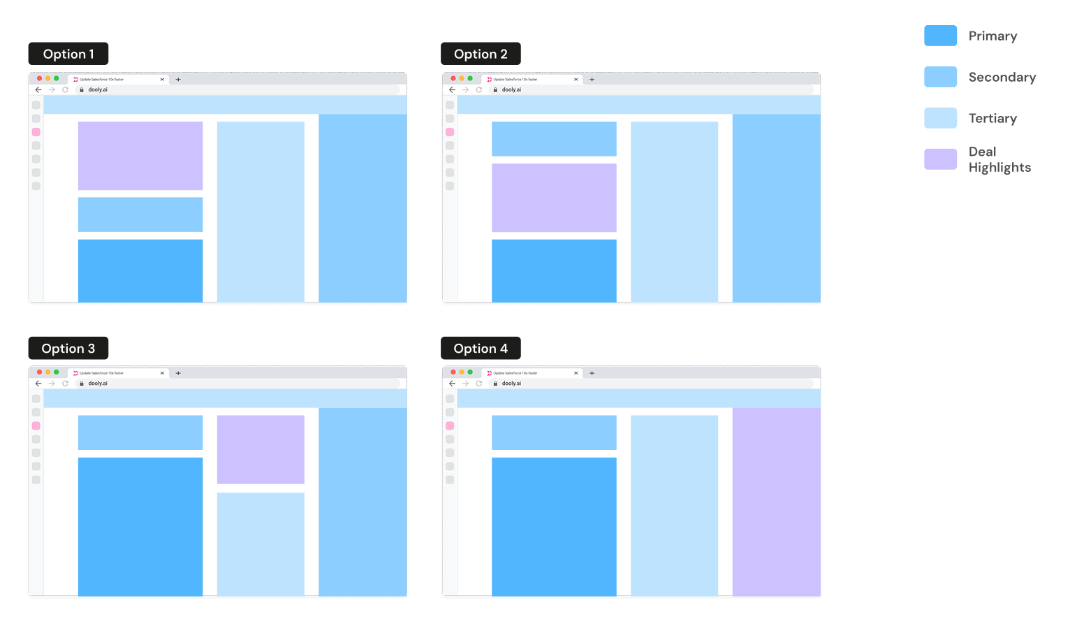
The drawer won on a combination of feasibility, the priority map and user feedback. It keeps the context available when a rep wants it without permanently spending prime real estate in the editor, and it was what engineering could realistically build in the time we had. The first two options both pushed the note itself further down the page, and the note is what people open Dooly to work in.
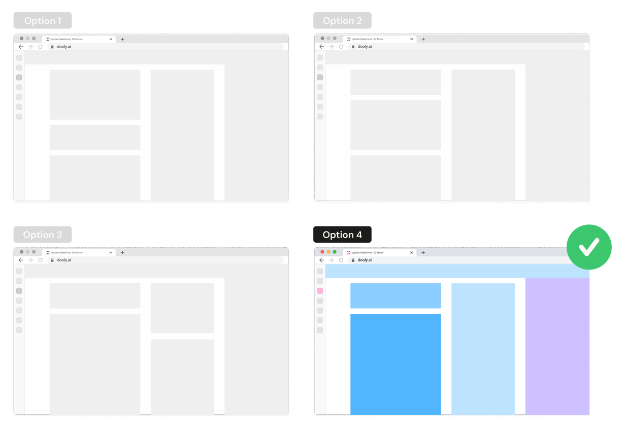
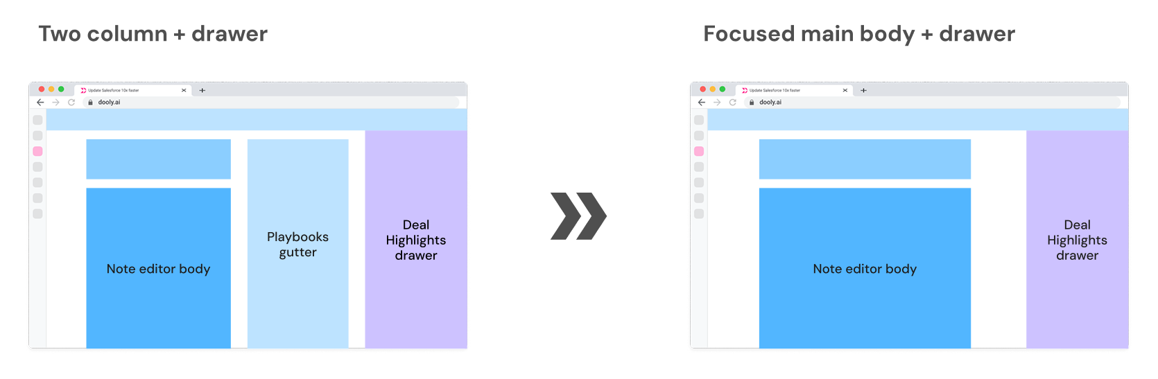
Choosing the drawer created the next problem, because having the note editor, the right gutter and the drawer all visible at once is too much for one page to carry, so something had to come out. The gutter was the obvious candidate, which put me straight into a conversation about the feature living in it.
Move Playbooks rather than remove it
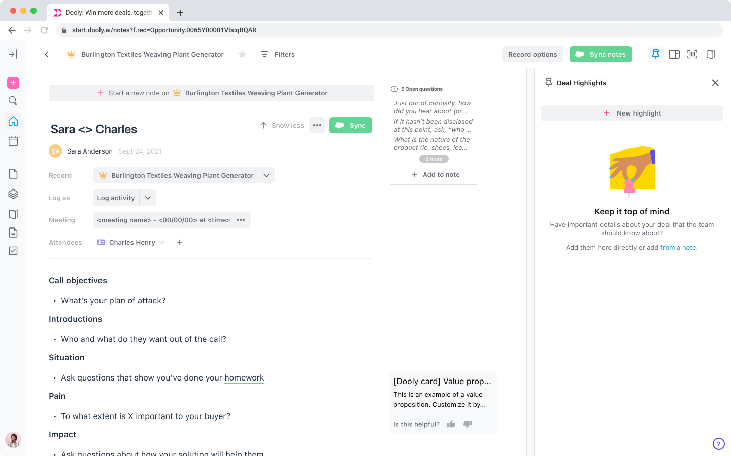
Playbooks lived in the gutter as index cards triggered by a keyword, a persona or a deal stage, which gave reps a fast way to handle an objection in the middle of a call. I was tasked with removing the gutter to make room for the drawer.
Go-to-market pushed back on that, with reason, since Playbooks was a key selling point and generated real interest with our buyers. Our data showed low adoption among the people who actually had it, though, and the component had performance problems and couldn’t render in the Chrome extension at all. So we had a feature carrying commercial weight it wasn’t carrying in usage, sitting on the part of the page we wanted to build on next.
Rather than execute the removal or abandon it, I sat down with a customer success partner. I wanted to understand what customers were actually worried about, what the change might do to acquisition and churn, and which parts of Playbooks were must haves against nice to haves in how people used it. Working with enablement and engineering alongside that, I got clear on how the cards were triggered and what reps were doing at the moment one fired.
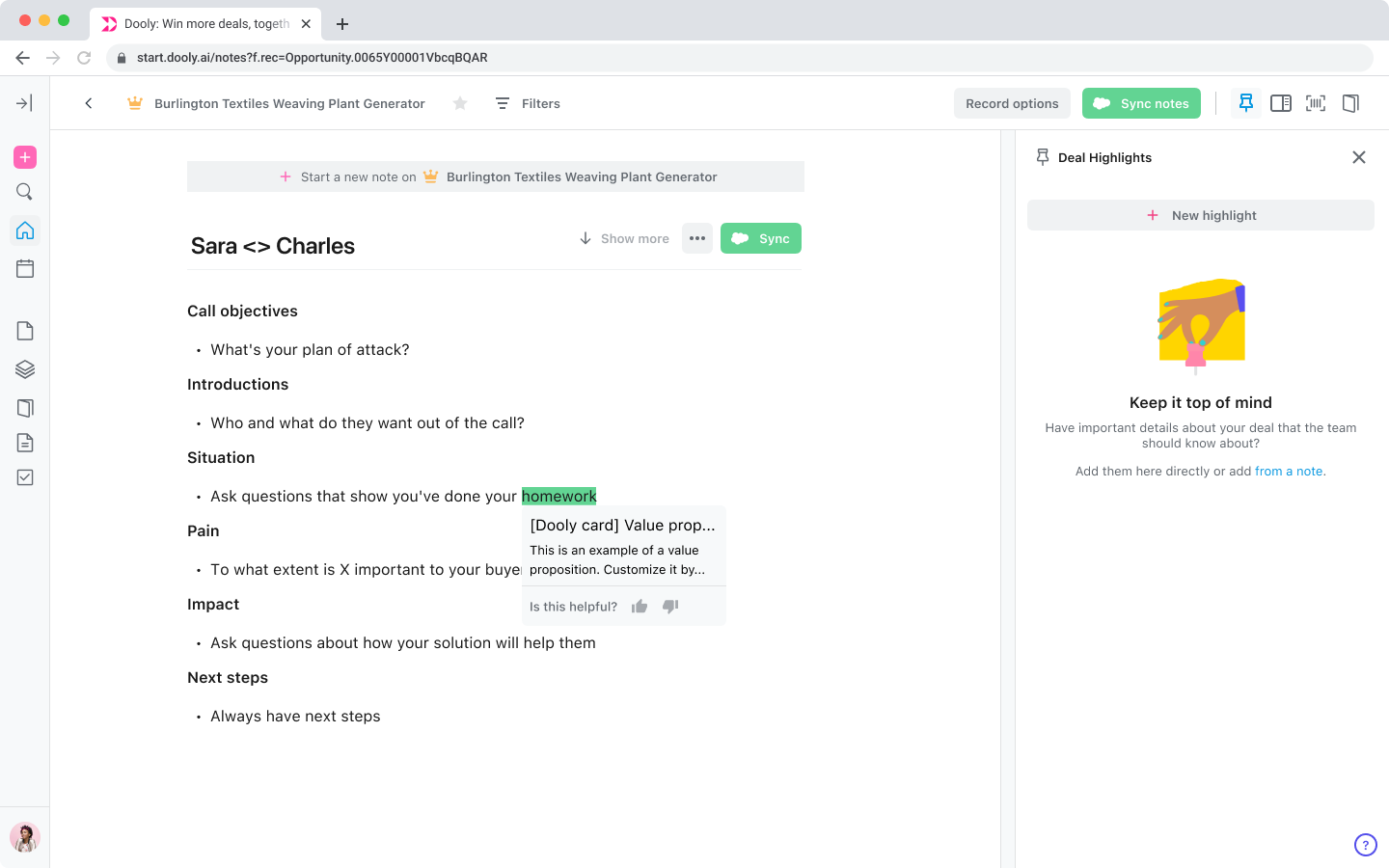
What came out of it was that the value sat in the contextual triggering rather than in where the cards happened to live. So we moved them inline, appearing next to the keyword the rep had just typed, which put them closer to the moment of need than the gutter had them. That freed the space for the drawer while keeping the thing go-to-market cared about, and we built a plan with customer success to walk existing users through the change before it landed.
Before
After
What I made, and the thinking behind it
With the space settled, the design work was about keeping the cost of capturing something close to zero, and making the result useful to two different people.
We phased it deliberately, so the first release was single player, meaning one rep adding context to a deal assigned to them in their own drawer. The multiplayer pieces came in a second phase, which is when highlights started surfacing on the record overview for the wider team, other people could add to the same deal, and reactions arrived. Shipping the single player version first meant we found out whether reps would capture anything at all before we built collaboration on top of a drawer that might have stayed empty.
The model
The unit
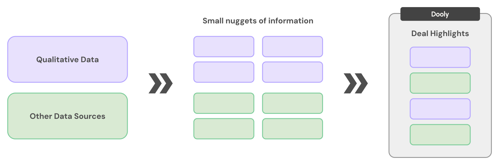
Capture
One click from a note, or written straight into the drawer
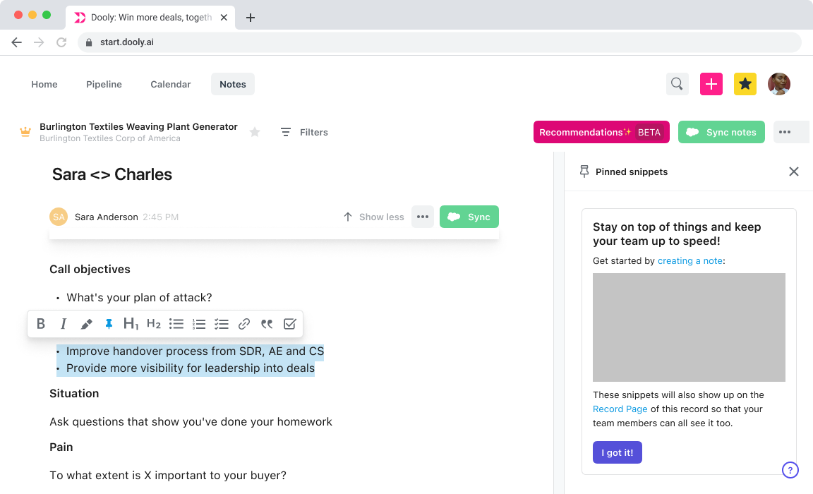
Reps run from meeting to meeting without much time to tidy up their notes, so anything that took real effort to pull out was never going to get pulled out. Highlighting text in a note and hitting the pin in the toolbar promotes it straight into the drawer, and anything that never came from a note in the first place can be typed directly into the drawer instead.
We needed that second path because a good share of what was getting lost never came through a meeting at all. The Slack message about the Series B, something a colleague mentioned in passing, none of it fits into a note.
Collaboration · Phase two
Reactions, so a manager can respond without a meeting
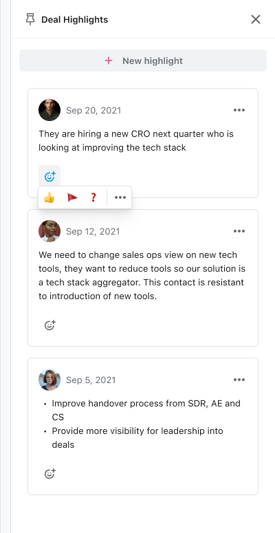
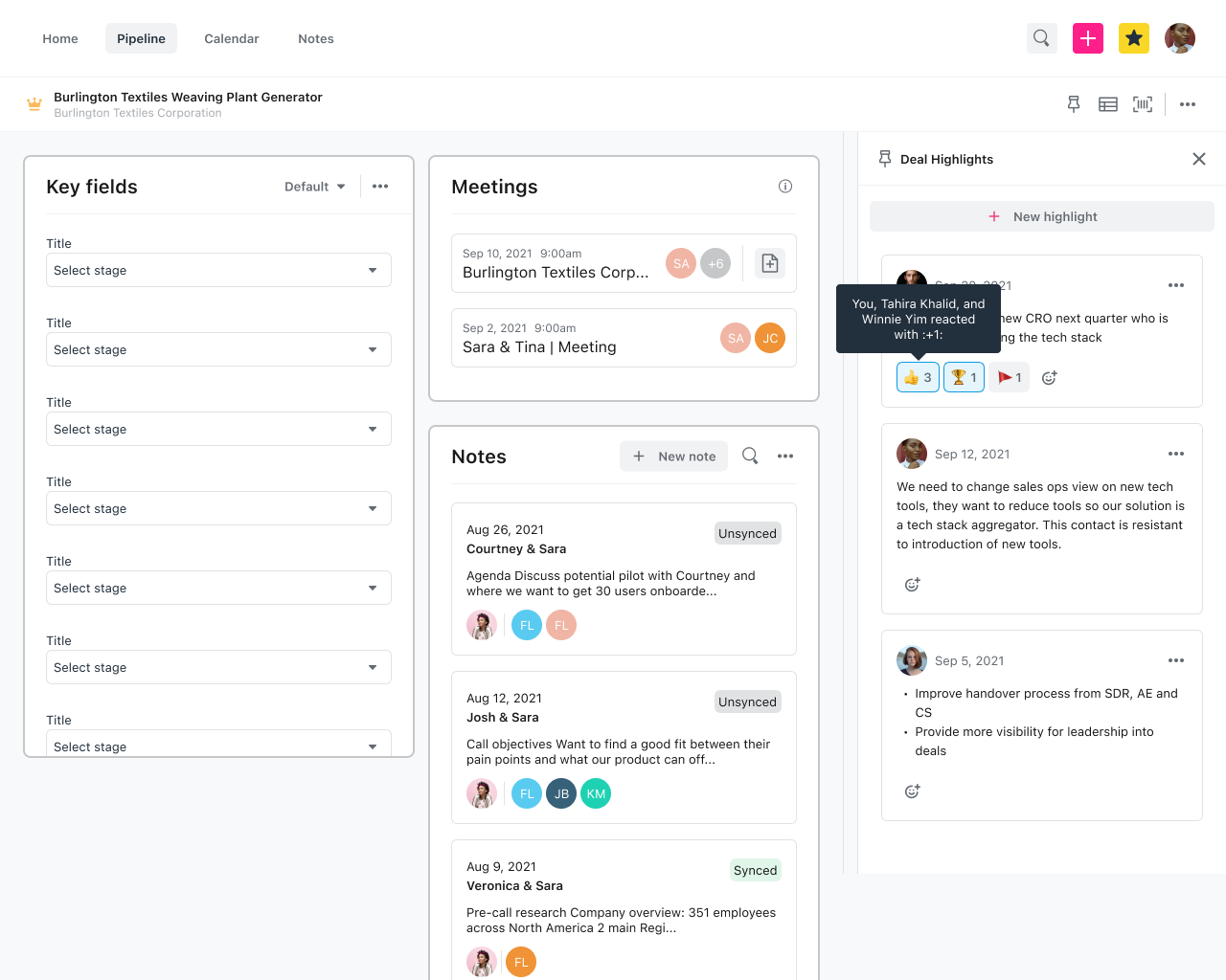
Once highlights were showing up on the record overview, the manager side needed a way in that cost them almost nothing. A manager reads the highlights on a record, and a thumbs up, a flag or a question mark is enough to say “good catch,” “this worries me,” or “let’s talk about this one.”
That was enough to turn the record from something a manager reviewed on their own into something the two of them talked about. It also gave the rep specific things to bring into their next one on one.
Naming
From Pinned Snippets to Deal Highlights
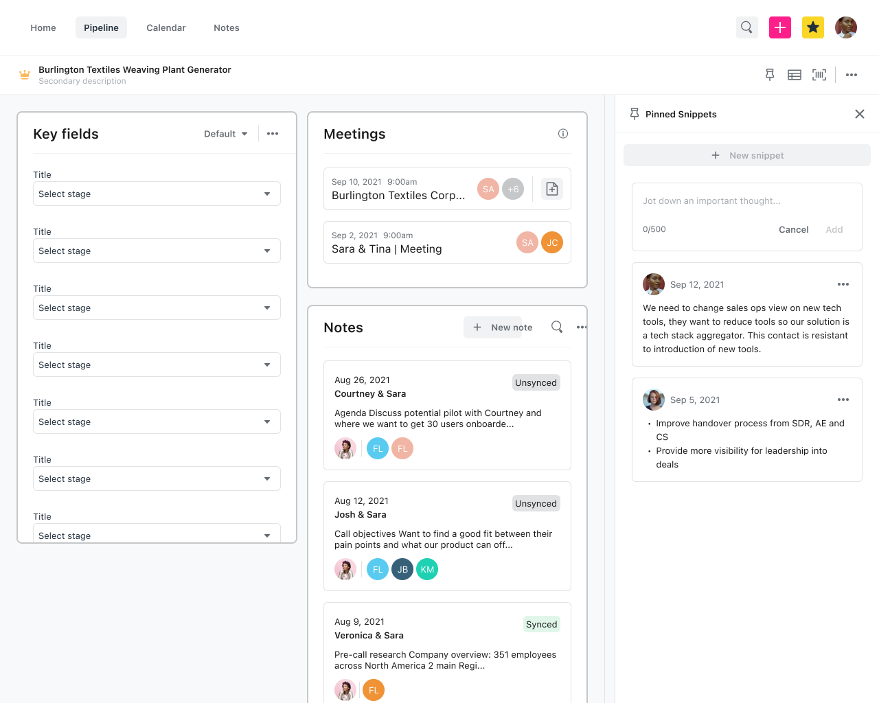
We started with Pinned Snippets, and it made sense while the feature was a bookmark into a note. As it developed, that name started making promises the product didn’t keep. If a snippet is a piece of a note, does editing the note change the snippet, and are the two synced?
We decided they weren’t synced, since a highlight captures a moment in time, and users had told us they needed to add context that never came from a note at all. Once that was settled, the old name was describing a different feature. I worked with product marketing on alternatives and we landed on Deal Highlights, which sat closest to the language account executives already used.
Before
After
Working through it with engineering
My PM, my engineering manager and I broke the idea down into pieces we could actually ship, using MoSCoW to sort it and a running project brief that linked the Figma files, the Looker dashboards and the Jira tickets together. Keeping those connected mattered because the feature touched the editor, and the editor touched everything.
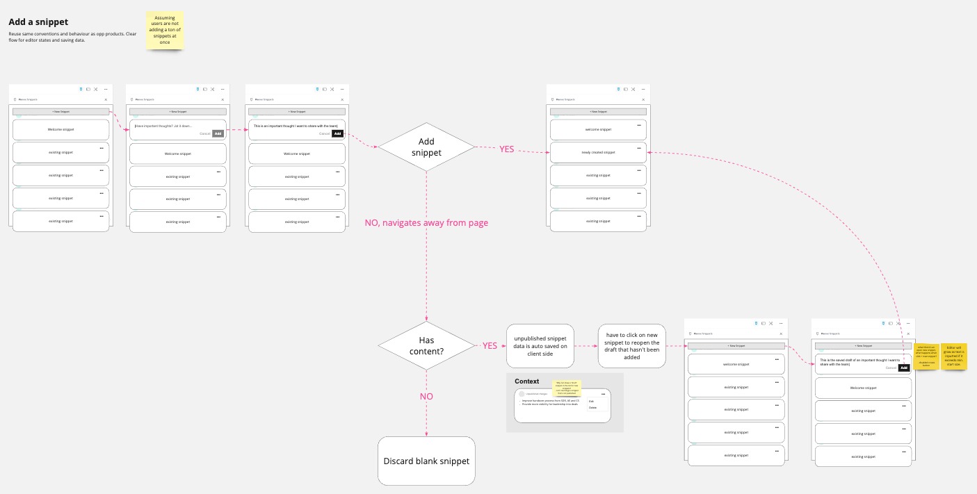
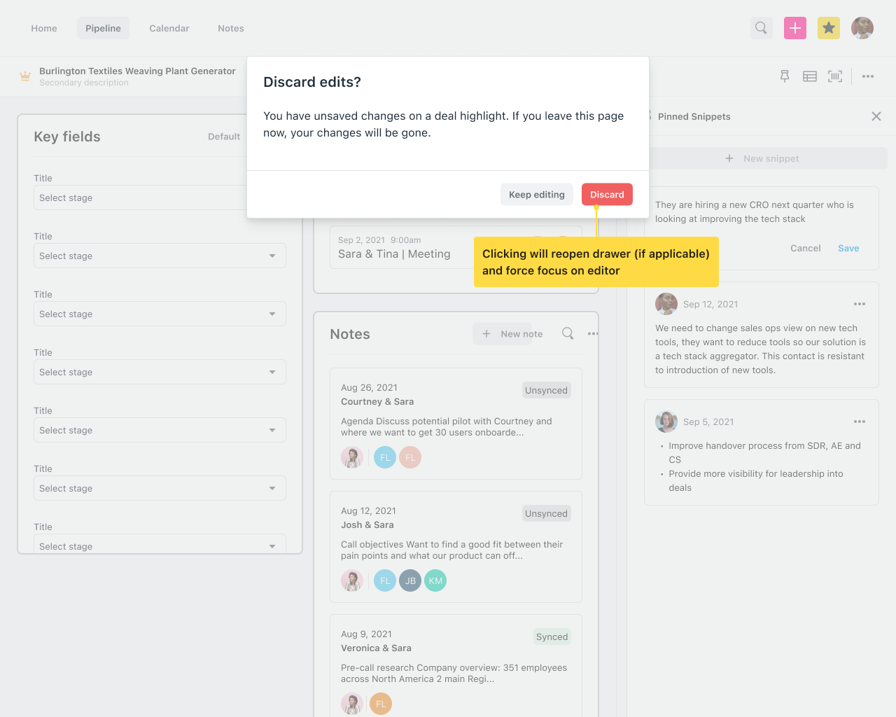
The conversation that took the most work was about error prevention, since we had no standard pattern for what happens to unsaved data when someone navigates away, and engineering argued against introducing one and growing the scope. I told them the concern was fair. Then I walked them through why error prevention mattered in this particular flow, and pulled the data on how often the feature would be used and how many people it would touch, so we were weighing the risk against numbers instead of against a principle.
We landed on a split with the PM. The internal release shipped without it so we could start testing sooner, and the confirmation dialog went in before it reached the public, so neither the timeline nor the experience had to give way entirely. I took the underlying pattern question back to the design team afterwards, and error prevention became something we aligned on in the design system rather than something each of us solved separately.
Outcomes
The sentiment was good and the testimonials were real, and the adoption numbers on the first release were not where we wanted them, so this one needs both halves stated together.
Account executive
“Deal Highlights are excellent for showcasing point in time information about a specific account.”
Account executive
“Deal Highlights definitely add value. It makes it easy to communicate a high level recap of key points with people who are not in the meeting or I want to report back to my manager.”
Roughly 60% positive sentiment in our customer success surveys, plus strong testimonials from account executives.
Adoption on the first release was low. We had solid instrumentation and could see it clearly, and the two reasons were that people weren't finding the feature and that the single player version was a thin slice of an idea that needed more of its pieces before it paid off.
The feature changed how insight sharing worked inside a product boxed in by Salesforce, and the conversations it started between reps and their managers were the thing customers kept describing back to us.
Simplifying the editor down to a body and a drawer freed the layout for the drawer based features that came after it.
The limits of manual capture
Even with capture down to a click, we were still asking a rep to notice the important thing and stop to pin it, in the few minutes between calls. That ceiling showed up in the usage, and better interaction design wasn’t going to move it.
I ran into the same limit on a separate feature I designed next, the About This Deal card. It pulled next steps out of the note and into a card beside it so reps could keep them current without digging. Users making field updates from the card went up 18%, and the share of daily users engaging with it went up 23%, but reps still had to type every update.
Both pointed to the same need: the product had to pull the important details out of what reps had already written and put them where reps could act on them. I pushed for that as the next phase, starting with generated next step suggestions that the rep approves.
Designing this today I’d start from AI doing the summarizing, with the rep steering and correcting rather than remembering. Most of my design work would go into what happens when it gets something wrong, since a rep who can’t easily fix a bad suggestion stops trusting the rest.
What I’d do differently
The part I’d change is discoverability. We had no pattern for introducing a new feature, and between the design debt, the technical debt and squad priorities around onboarding, it stayed an afterthought instead of becoming a problem someone owned. I raised it before we shipped and I understood why it kept losing, but I took it back to the team as a roadmap item only after launch, which is where it needed to be well before. Bringing product marketing and go-to-market in from the start would have made getting this in front of people part of the plan.
I’d also set expectations differently on the early numbers. One rep pinning notes into their own drawer is useful, but the value arrives once a manager is reacting and context is coming from more than one person. Our first read measured a thin slice, and it improved as we built more of it out.